Time Series Analysis
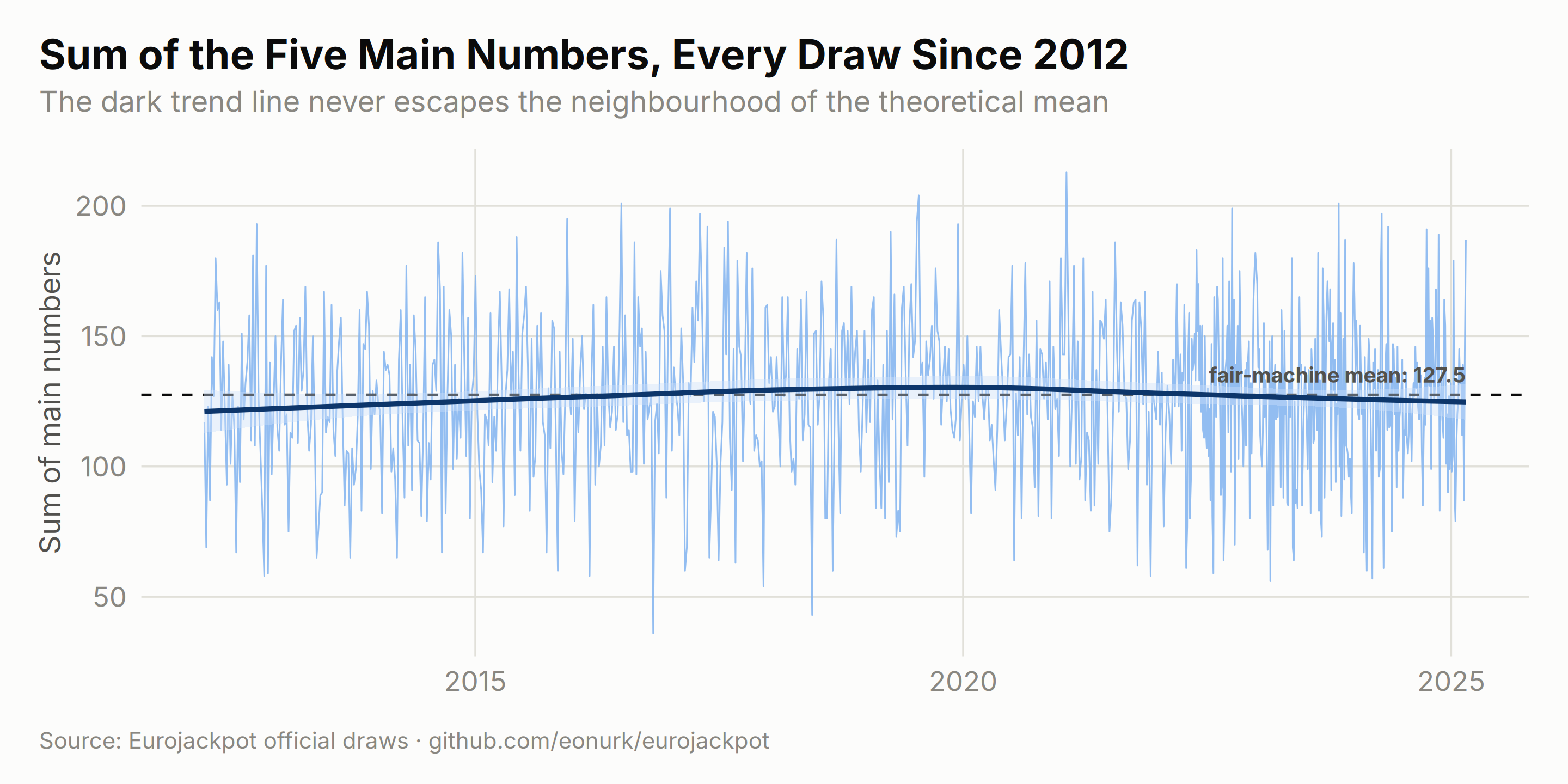
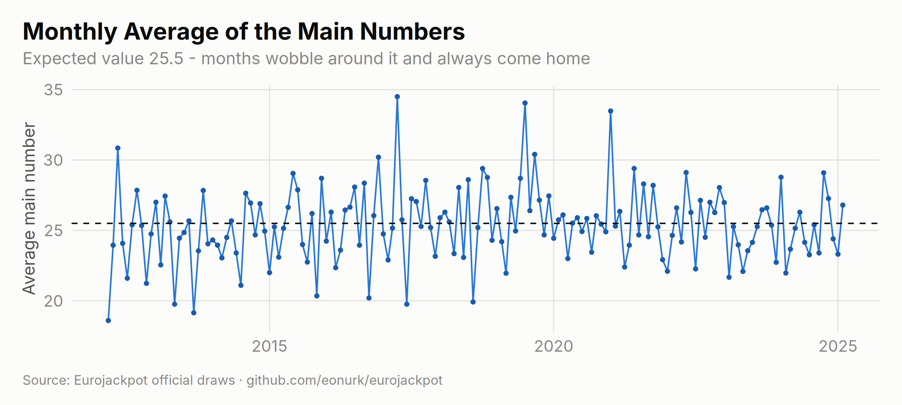
If the machine drifted — a worn ball here, a heavier pocket there — it would show up over time: sums creeping up, spreads narrowing, seasons mattering. So we put fourteen years of draws on a timeline and look for exactly that. What follows is a masterclass in how convincingly pure noise can impersonate a trend, until you draw the expectation line through it.
The Sum of Each Draw
Adding up the five main numbers compresses every draw into one number. Under fair play its long-run average should sit at (1 + 50)/2 × 5 = 127.5:
# Calculate sum of main numbers for each draw
results$main_sum <- rowSums(results[, paste0("main_", 1:5)])
results$main_avg <- results$main_sum / 5

ggplot(results, aes(x = draw_date, y = main_sum)) +
    geom_line(color = "#86b6ef", linewidth = 0.35, alpha = 0.9) +
    geom_hline(yintercept = 127.5, linetype = "dashed", color = ej_ink, linewidth = 0.55) +
    geom_smooth(method = "loess", color = ej_blue_deep, linewidth = 1.1, se = TRUE, fill = "#cde2fb") +
    annotate("text",
        x = max(results$draw_date), y = 127.5, label = "fair-machine mean: 127.5",
        hjust = 1, vjust = -0.8, size = 3.4, color = ej_ink2, fontface = "bold"
    ) +
    labs(
        title = "Sum of the Five Main Numbers, Every Draw Since 2012",
        subtitle = "The dark trend line never escapes the neighbourhood of the theoretical mean",
        x = NULL, y = "Sum of main numbers", caption = ej_caption
    )
# Monthly average of main numbers
results$month_year <- format(results$draw_date, "%Y-%m")
monthly_avg <- aggregate(main_avg ~ month_year, data = results, FUN = mean)
monthly_avg$date <- as.Date(paste0(monthly_avg$month_year, "-01"))

ggplot(monthly_avg, aes(x = date, y = main_avg)) +
    geom_line(color = ej_blue, linewidth = 0.6) +
    geom_point(color = ej_blue_dark, size = 1.3) +
    geom_hline(yintercept = 25.5, linetype = "dashed", color = ej_ink, linewidth = 0.55) +
    labs(
        title = "Monthly Average of the Main Numbers",
        subtitle = "Expected value 25.5 - months wobble around it and always come home",
        x = NULL, y = "Average main number", caption = ej_caption
    )
Numbers Over Time
Zooming into the most recent seasons: each line is one of the five sorted ball positions. The fan-shaped bands are order statistics at work — the smallest ball lives low, the largest lives high, and everything shuffles inside its lane:
main_numbers_time <- results %>%
    filter(year >= 2024) %>%
    select(draw_date, main_1, main_2, main_3, main_4, main_5) %>%
    pivot_longer(
        cols = starts_with("main_"),
        names_to = "position",
        values_to = "number"
    ) %>%
    mutate(position = factor(position,
        levels = paste0("main_", 1:5),
        labels = c("1st (lowest)", "2nd", "3rd", "4th", "5th (highest)")
    ))

ggplot(main_numbers_time, aes(x = draw_date, y = number, color = position)) +
    geom_line(alpha = 0.75, linewidth = 0.55) +
    geom_point(size = 0.9) +
    scale_color_manual(values = ej_ramp(5)) +
    scale_y_continuous(breaks = seq(0, 50, by = 10), limits = c(0, 51)) +
    labs(
        title = "The Five Sorted Ball Positions, 2024-2025",
        subtitle = "Positions are sorted within each draw, so the lanes never cross - the spacing between them is pure chance",
        x = NULL, y = "Number value (1-50)", caption = ej_caption
    ) +
    guides(color = guide_legend(nrow = 1))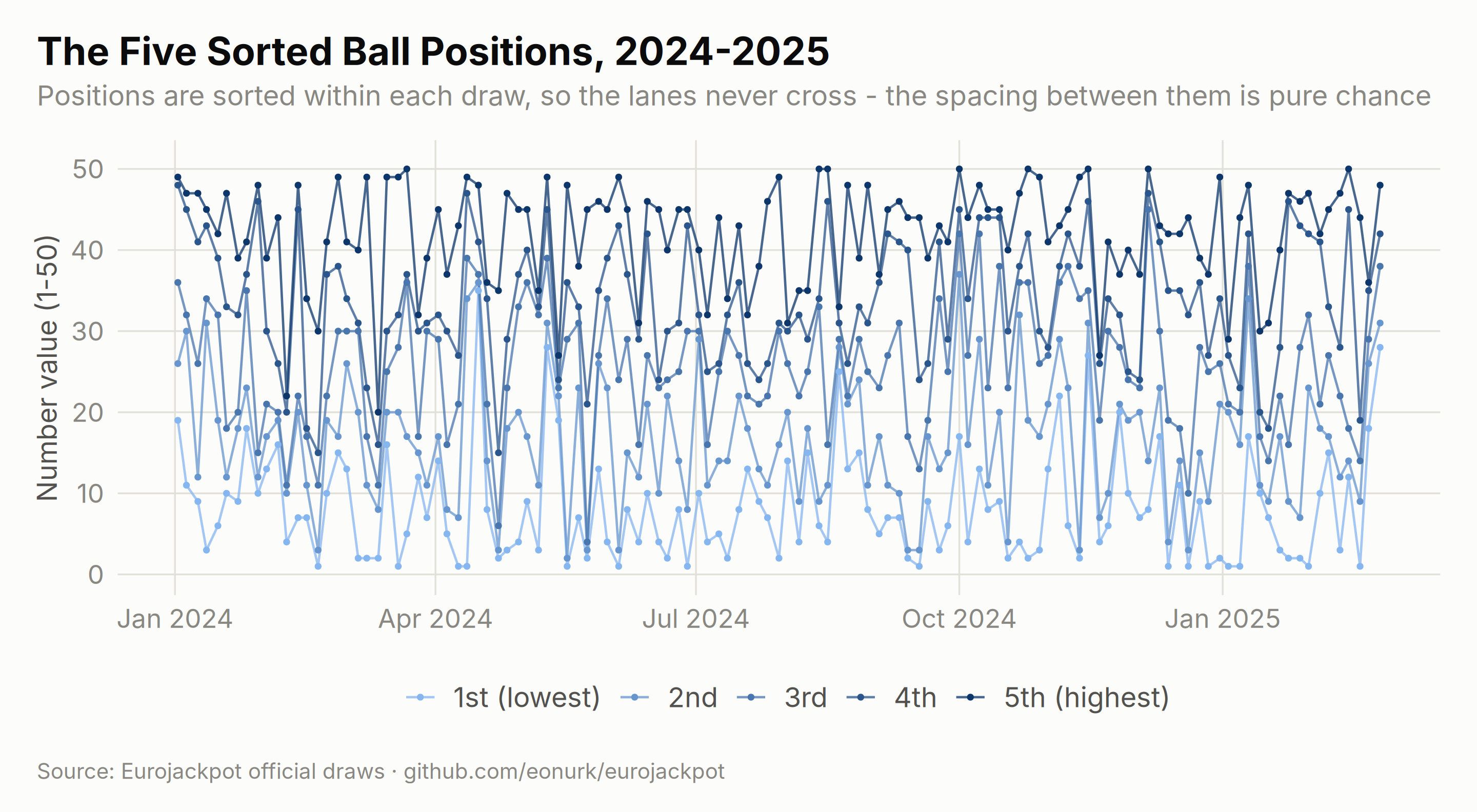
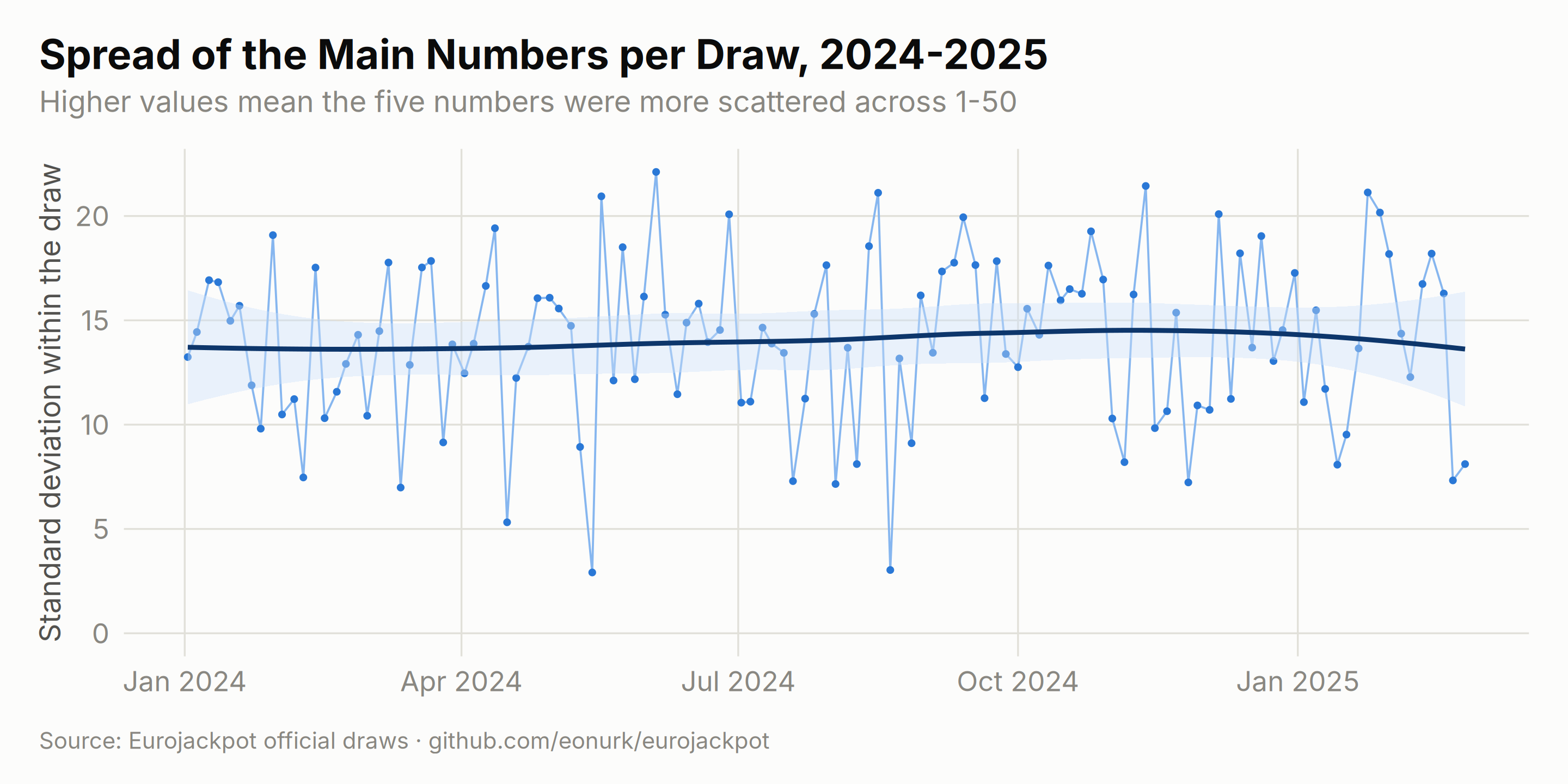
Spread Within a Draw
How scattered are the five numbers of a single draw? The standard deviation per draw has a theoretical resting place too, and the trend line refuses to leave it:
std_dev_over_time <- results %>%
    filter(year >= 2024) %>%
    select(draw_date, main_1, main_2, main_3, main_4, main_5) %>%
    rowwise() %>%
    mutate(std_dev = sd(c(main_1, main_2, main_3, main_4, main_5))) %>%
    ungroup()

ggplot(std_dev_over_time, aes(x = draw_date, y = std_dev)) +
    geom_line(color = "#86b6ef", linewidth = 0.45) +
    geom_point(size = 1, color = ej_blue) +
    geom_smooth(method = "loess", se = TRUE, color = ej_blue_deep, linewidth = 1.05, fill = "#cde2fb") +
    scale_y_continuous(limits = c(0, NA)) +
    labs(
        title = "Spread of the Main Numbers per Draw, 2024-2025",
        subtitle = "Higher values mean the five numbers were more scattered across 1-50",
        x = NULL, y = "Standard deviation within the draw", caption = ej_caption
    )
Seasonal Patterns
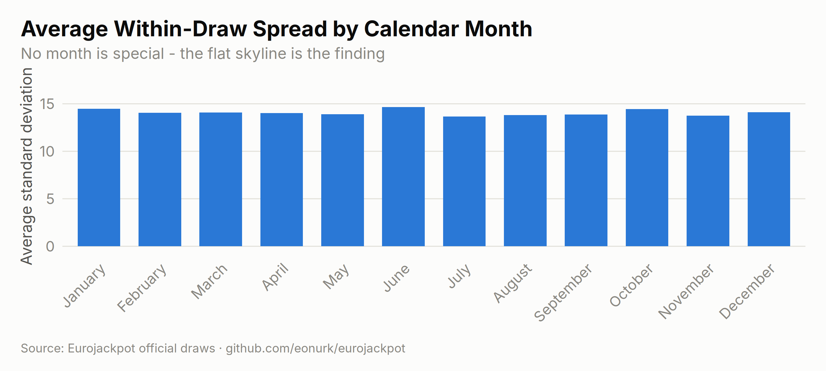
Do summer draws behave differently from winter ones? Averaging each draw’s internal spread by calendar month gives every folk theory a fair shot:
monthly_analysis <- results %>%
    rowwise() %>%
    mutate(draw_sd = sd(c(main_1, main_2, main_3, main_4, main_5))) %>%
    ungroup() %>%
    group_by(month) %>%
    summarise(
        draws = n(),
        avg_std_dev = mean(draw_sd),
        .groups = "drop"
    ) %>%
    mutate(month_name = factor(month.name[as.numeric(month)], levels = month.name))

ggplot(monthly_analysis, aes(x = month_name, y = avg_std_dev)) +
    geom_col(fill = ej_blue, width = 0.7) +
    coord_cartesian(ylim = c(0, max(monthly_analysis$avg_std_dev) * 1.15)) +
    labs(
        title = "Average Within-Draw Spread by Calendar Month",
        subtitle = "No month is special - the flat skyline is the finding",
        x = NULL, y = "Average standard deviation", caption = ej_caption
    ) +
    theme(
        panel.grid.major.x = element_blank(),
        axis.text.x = element_text(angle = 45, hjust = 1)
    )